Scatter Diagram
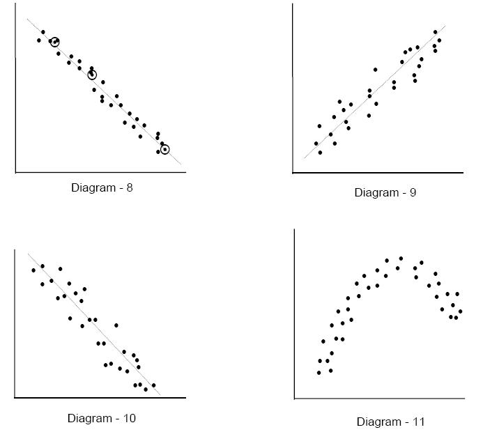
When solving a problem or analyzing a situation one needs to know the relationship between two variables. A relationship may or may not exist between two variables. If a relationship exists, it may be positive or negative, it may be strong or weak and may be simple or complex. A tool to study the relationship between two variables is known as Scatter Diagram. It consists of plotting a series of points representing several observations on a graph in which one variable is on X-axis and the other variable in on Y-axis. If more than one set of values are identical, requiring more points at the same spot, a small circle is drawn around the original dot to indicate second point with the same values. The way the points lie scattered in the quadrant gives a good indication of the relationship between the two variables. Let us see some common patterns seen in Scatter Diagrams and the conclusions one can draw based on these patterns. Diagrams 6 to 11 show some of the more common patterns.
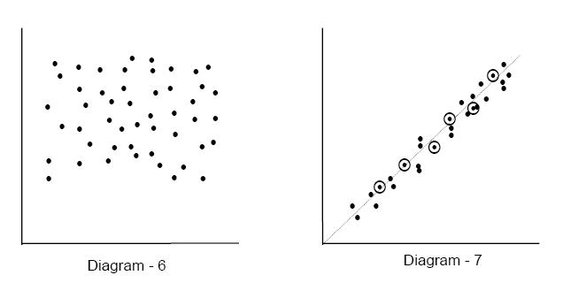
Diagram 6 shows a random distribution of points all over the quadrant. Such a distribution or scatter indicates a lack of relationship between the two variables being studied. In Diagram 7, the points appear scattered closely along a line (shown as a dotted line in the diagram) travelling from the Southwest to the Northeast direction indicating that if the variable on X-axis increases, the variable on Y-axis also increases. This is a positive relationship. As the points are very closely scattered around the straight line, the relationship is said to be strong. Diagram 8, in which the points are scattered closely around a line sloping in Northwest to Southeast direction, indicates a strong negative relationship. A negative relationship means that the variable on Y-axis goes down as the variable on X-axis goes up. Diagrams 9 and 10 shows a scatter of points loosely spread around lines in directions similar to Diagrams 10 and 8 respectively. Hence scatter in Diagram 9 indicates a weak positive relationship and that in Diagram 10 indicates a weak negative relationship. Weak relationship means that the variables are related but there are possibly other factors besides the variable on X-axis also affecting the variable on Y-axis. If other factors are kept constant in a controlled experiment and the data is again plotted, it would result in a scatter showing a strong relationship. Diagrams 7 to 10 showed a simple linear relationship between the two variables over the entire range. Very often the relationship is not that simple. The variable on Y-axis may increase up to a point as the variable on X-axis is increased but after that it may stay the same or even decrease. Diagram 11 shows one such complex scatter.