A critical feature of M&T is to understand what drives energy consumption. Is it production, hours of operation or weather? Knowing this, we can then start to analyse the data to see how good our energy management is.
After collection of energy consumption, energy cost and production data, the next stage of the monitoring process is to study and analyse the data to understand what is happening in the plant. It is strongly recommended that the data be presented graphically. A better appreciation of variations is almost always obtained from a visual presentation, rather than from a table of numbers. Graphs generally provide an effective means of developing the energy-production relationships, which explain what is going on in the plant.
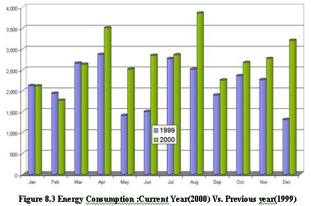
The energy data is then entered into a spreadsheet. It is hard to envisage what is happening from plain data, so we need to present the data using bar chart. The starting point is to collect and collate 24/12 months of energy bills. The most common bar chart application used in energy management is one showing the energy per month for this year and last year (see Figure 8.3) – however, it does not tell us the full story about what is happening. We will also need production data for the same 24/12-month period. Having more than twelve months of production and energy data, we can plot a moving annual total. For this chart, each point represents the sum of the previous twelve months of data
In this way, each point covers a full range of the seasons, holidays, etc. The Figure 8.4 shows a moving annual total for energy and production data.
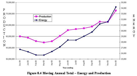
This technique also smoothens out errors in the timing of meter readings. If we just plot energy we are only seeing part of the story – so we plot both energy and production on the same chart – most likely using two y-axes. Looking at these charts, both energy and productions seem to be “tracking” each other – this suggests there is no major cause for concern. But we will need to watch for a deviation of the energy line to pick up early warning of waste or to confirm whether energy efficiency measures are making an impact.
For any company,we also know that energy should directly relate to production. Knowing this, we can calculate Specific Energy Consumption (SEC), which is energy consumption per unit of production. So we now plot a chart of SEC (see Figure 8.5).
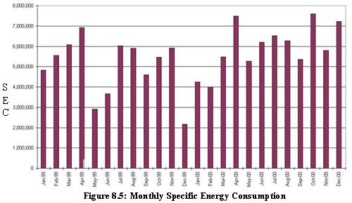
At this point it is worth noting that the quality of your M&T system will only be as good as the quality of your data – both energy and production. The chart shows some variation – an all time low in December 99 followed by a rising trend in SEC.
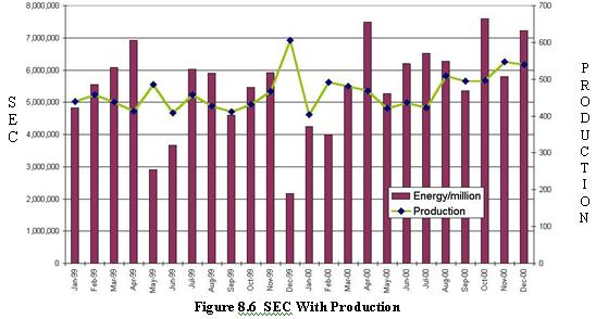
We also know that the level of production may have an effect on the specific consumption. If we add the production data to the SEC chart, it helps to explain some of the features. For example, the very low SEC occurred when there was a record level of production. This indicates that there might be fixed energy consumption – i.e. consumption that occurs regardless of production levels. Refer Figure 8.6.
The next step is to gain more understanding of the relationship of energy and production, and to provide us with some basis for performance measurement. To do this we plot energy against production – In Microsoft Excel Worksheet, this is an XY chart option. We then add a trend line to the data set on the chart. (In practice what we have done is carried out a single variable regression analysis!). The Figure 8.7 shown is based on the data for 1999.
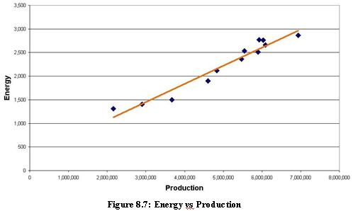
We can use it to derive a “standard” for the up-coming year’s consumption. This chart shows a low degree of scatter indicative of a good fit. We need not worry if our data fit is not good. If data fit is poor, but we know there should be a relationship, it indicates a poor level of control and hence a potential for energy savings.
In producing the production/energy relationship chart we have also obtained a relationship relating production and energy consumption.
Where M is the energy consumption directly related to production (variable) and C is the “fixed” energy consumption (i.e. energy consumed for lighting, heating/cooling and general ancillary services that are not affected by production levels). Using this, we can calculate the expected or “standard” energy consumption for any level of production within the range of the data set.
We now have the basis for implementing a factory level M&T system. We can predict standard consumption, and also set targets – for example, standard less 5%. A more sophisticated approach might be applying different reductions to the fixed and variable energy consumption. Although, the above approach is at factory level, the same can be extended to individual processes as well with sub metering.
At a simplistic level we could use the chart above and plot each new month’s point to see where it lies. Above the line is the regime of poor energy efficiency, and below the line is the regime of an improved one.